In optometry practices, patient traffic isn’t just about moving bodies from waiting room to exam chair. It’s a carefully engineered journey that blends clinical efficiency with retail psychology. Think of it as your “optical path”—a deliberate route that turns every step into an opportunity for connection, trust, and ultimately, higher frame and lens sales.
Smart office design can boost retail conversion rates dramatically. Strategic layouts in retail environments have been shown to improve sales by 20–40% simply by guiding natural movement patterns. Here’s how the science works and how you can apply it.
1. Understand the Psychology of Patient Movement
People behave predictably in retail spaces. Upon entering any store, 90% of customers turn right first. This “right-hand rule” is hardwired. After that initial turn, most shoppers follow a natural counterclockwise loop through the space.
In an optometry office, this means your entry zone (right side) sets the emotional tone. Use it to showcase your brand story—premium frames, lifestyle photography, or seasonal promotions. Poor placement here wastes the most valuable real estate in the entire practice.
Patients also arrive with mixed motivations. Research identifies four key attitudes toward eyewear purchases: style (fashion and social approval), vision (clarity and eye health), avoiding (discomfort with the process), and seeking (desire for technical lens info). Your layout must address all four simultaneously while gently steering “avoiders” into the optical without friction.
2. Build a Circular “Optical Path” That Flows Naturally
The most successful modern optometry offices ditch the traditional linear model for a circular or horseshoe layout:
- Entry → Reception/Check-in (clear sightlines, immediate greeting)
- Pre-testing (multi-purpose stations)
- Exam rooms (positioned away from retail for privacy)
- Optical/dispensing area (patients exit through here)
This progression feels intuitive rather than forced. Patients finish their exam and literally walk into the retail experience. Many practices now route both entrance and exit through the optical, turning every visit into a browsing opportunity.
Key flow rules:
- Keep pathways at least 3–4 feet wide (ADA-compliant and comfortable for families).
- Use transition displays—eye-catching frame walls or lifestyle vignettes—right outside exam rooms to pull patients seamlessly into the optical without needing a staff invitation.
- Avoid bottlenecks by adding multiple check-in/out stations or mobile tablets at dispensing tables. Nothing kills a sale faster than a line at the register.
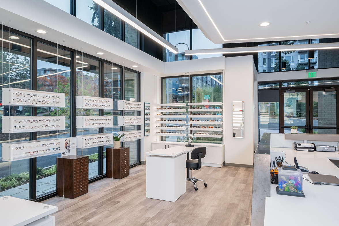
3. Merchandise Along the Path Like a Pro Retailer
Treat your optical as a true retail boutique, not an afterthought. Hre’s how to design the path itself:
- Zone by customer type: Women’s premium on the right (first impression zone), men’s next, kids/sunglasses in dedicated sections. This reduces decision fatigue and increases perceived value.
- Rule of Three + Pyramid Displays: Group frames in threes (psychologically pleasing) and arrange in pyramid shapes (hero frame at top, cascading options below). Eye-tracking studies show this format draws attention and simplifies choice.
- Lighting as a Traffic Director: Use focused spotlights and contrast (light on product, subtle shadow in negative space) to pull eyes forward. Well-lit frames “pop” and encourage movement deeper into the space.
- Signage That Sells: Clear pricing, benefit-focused calls-to-action (“Upgrade to Blue-Light Protection”), and promotional highlights guide flow while addressing the “seeking” and “style” mindsets.
Modern displays matter—glass shelves, built-in cubbies, and interactive mirrors outperform old frame boards. Separate fitting/ordering counters from adjustments to keep traffic moving smoothly.
4. Make the Optical the Grand Finale (and the Exit)
The single biggest sales lever: force the path through the optical twice—once on the way in (subtle browsing) and once on the way out (post-exam purchase momentum).
Patients who have just heard their prescription are emotionally primed to buy. When the dispensing area feels like a warm, inviting boutique rather than a clinical add-on, conversion skyrockets. Add comfortable seating, mirrors with flattering lighting, and a refreshment station to extend dwell time—the longer patients linger comfortably, the more they spend.
5. Measure, Track, and Iterate with Data
Great design isn’t guesswork. Install simple traffic counters or use practice management software to monitor:
- Peak flow times
- Bottleneck zones
- Optical conversion rate (visits → frame sales)
Review weekly. If patients bypass the premium section, reposition transition displays. If lines form at checkout, add a second station. Top practices treat their floor plan like a living experiment—constantly refined based on real patient behavior.
Ready to Redesign Your Optical Path?
Start small if a full renovation isn’t in the budget:
- Audit your current right-side entry zone—what’s the first impression?
- Add one strategic transition display outside the exam rooms.
- Route at least 50% of patient exits through the optical.
- Upgrade lighting on your best-selling frames.
The science is clear: when patient traffic flows naturally and effortlessly toward your eyewear collection, sales follow. Your office stops feeling like a doctor’s visit and starts feeling like a destination where patients happily invest in better vision—and better style.
Your patients’ eyes deserve the best care. Their wallets deserve the smoothest path to saying “yes.”
What’s one change you could make this month to improve your optical path? If you'd like help designing the perfect office flow, we've got you! Check out our Floor Planning and Space Evaluation Package to get started.